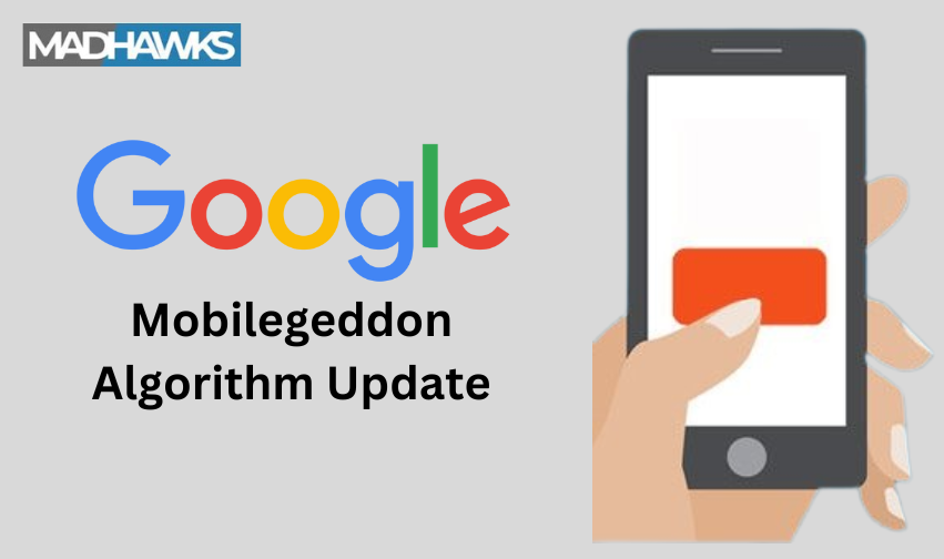
Another blog update in our series of Google’s 25th birthday, and its 25 unforgettable updates, we are back with a new and significant update. The Mobilegeddon algorithm update of Google which changed the dynamics of affordable SEO services.
Let’s have a look at what this Mobilegeddon algorithm update was all about, and how it changed SEO services strategies.
Decoding Mobilegeddon update
The Mobilegeddon update also known as the mobile-friendly update was released by Google in February 2015, after giving an intimation of this Google mobile update in December 2014. During this intimation Google said that it was working and testing on a new mobile-friendly update that will change the dynamics of website rankings and SEO.
This Google mobile-friendly update was released to elevate the user experience and offer them better searching experience with mobile-friendly websites and content. With this update there were two extremes only and no in-between grey area, which meant either your website was suitable as per the Mobilegeddon algorithm update or not.
Impact of Mobilegeddon algorithm update
While releasing this update, Google clarified that this mobile-friendly update was going to impact websites on three main aspects. These three factors are:
- Effects were limited to individual pages and not the entire website
- Affected the results in global languages
- Effects were observed in websites rankings in mobile only
Furthermore, with the release of this Google mobile update there was a lot of disturbance in the entire SEO world. Website owners were rushing and running, trying to make their websites and pages as per the Google mobile-friendly update.
Contributing Factors of Mobilegeddon Algorithm Update
Once this mobile-friendly update was released, there were several contributing factors such as:
- Design responsiveness
The layout or design that you choose for your website should be compatible with mobile-friendly update and should be responsive. This would allow the users to have easy access to information that they are looking for.
- Text legibility
Text font, and size should be compatible with the mobile version of the website. Too large or too small text would make the user reject your website. Easily readable text without the need to zoom in.
- Tap target size
Website buttons or links which were placed too near causing difficulty in opening the links were penalized, instead buttons with appropriate space were preferred.
- Page speed
Pages taking too long to load in the mobile version were downgraded and easy or quick loading pages were rewarded highly as it added to the experience of the user.
- Mobile compatibility
The website should be able to run seamlessly in the mobile device, plugins that were not compatible with mobile-friendly update were downgraded.
- Mobile accessibility
Easy navigation, well-structured menus and user friendly layout for seamless experience was rewarded whereas websites failing to do so were downgraded.
Recovery from Mobilegeddon Algorithm Update
After the release of the Mobilegeddon update website that faced low rankings or were affected, here are a few tips to recover from the effects.
- Mobile-friendly layout
While designing the website keep in mind to choose a layout that is suitable for the mobile version and is easy on the mobile, identify the areas which are not working well and modify the layout.
- Check page loading speed
Test your page loading speed in the mobile version and make changes if required.
- Text compatibility
The text size, and font should be easy to read without the need to pinch or zoom in.
- Incorporate responsive design
Include a layout that is highly responsive on highly sensitive mobile versions for a better experience.
- Optimized tap targets
Size of the tap targets should be optimum with proper gap in between to avoid any confusion.
- Mobile compatibility and accessibility
Ensure that your website is mobile compatible and accessible in terms of plugins available and if not, make the necessary changes.
- Local SEO optimization
Optmize your SEO keywords as per the local SEO as mobile versions would need local seo to provide the user with better results.
- Constant monitoring and analysis
Keep a check on your website and analyse if there are any changes or modifications required. This will help you maintain your website with the Google mobile-friendly update.
MadHawks on Mobilegeddon Algorithm Update
MadHawks, a leading digital marketing agency believes that the best way to connect with your users is through giving them easy access via mobiles. Hence, this Google update for mobile is something that changed the dynamics of the marketing.
This is one of the first steps toward the digital marketing revolution and hence we recommend you to keep your websites updated as per the Google mobile update. If you are confused on how to do this, get in touch with our expert team today.
FAQ
What is Google mobile update?
Google mobile update was released to make the websites more mobile friendly and responsive for easy access for users.
How did the mobile update change search engine results?
With this update the search engine results changed as this allowed the use of local seo, voice search which further incorporated semantic search and hence, the focus on keywords was reduced.
Does mobile friendly affect SEO?
Yes, mobile friendly search affects SEO, as to optimize the website for mobile friendly update there are certain changes that are required to be done such as focused keywords, and semantic search.
Is mobile-friendly a ranking factor?
Yes, mobile-friendly became a ranking factor to make more and more websites mobile-friendly and promote the adoption of mobile-friendly updates.
What is the advantage of mobile-friendly website?
Advantages of mobile-friendly websites include easy access to information, user accessibility, easy navigation, easy-to-read texts, etc.


