

Basic of Graphic Designing
Posted By Gaurav | 12-Oct-2022 | Search Engine Optimization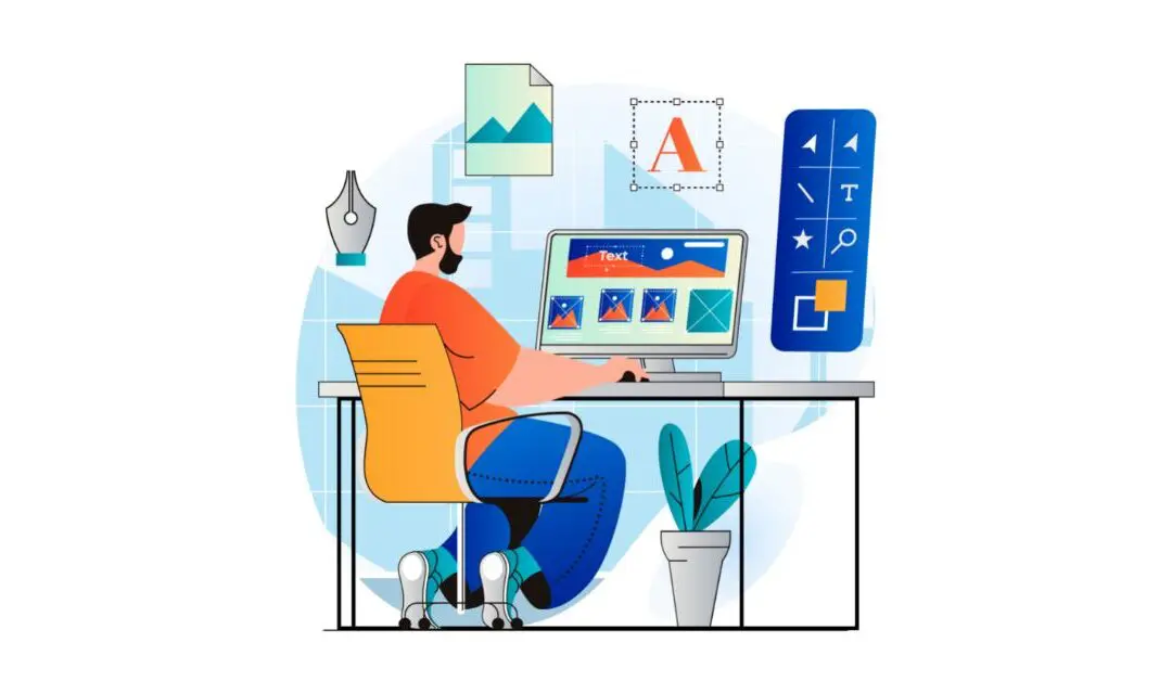
What is Graphic Designing?
Graphic design in 2022 is indeed a much sought-after skill. The main reason is that the world is a visual place and people are convinced by what they can see. Through graphics, you can sell your audience on a design, idea, lifestyle, or concept. Good graphic designing is very helpful as it can help produce high-end designs. These designs are helpful as they can be used to promote brands on a national and international scale.
Adding graphics to your design is a must in the present day and age. The key reason is that it can help you showcase your creative skills and make a good impression on your clients. This article will take a look at basic graphic design and help you to find an aesthetic and a style that is unique to you as well as the brand you are working for thus being able to help you scale up and take your creatives to the next level.
Graphic Designing Tips
1. Balance is mandatory
This refers to the art that includes being able to distribute graphic design elements. Also, it is key that you can spread them out well in your creativity. Designers in today’s age are the ones who should be able to tactfully choose between a balanced design or be able to choose and go ahead with an off-balanced (dynamic) layout.
- Symmetrical – This is the kind of design that relies majorly on the concept of symmetry.
- Asymmetrical – This type of balance employs scale, and ensures that the elements that you use are not perfectly symmetrical but are yet aesthetic.
- Radial– In this case the elements are placed in a circular pattern on the layout. Provides movement and dynamism which is great for the eyes of the viewer.
2. Alignment and we repeat ALIGNMENT
Alignment is needed in design, one faulty mistake and the entire Alignment help develop a sharp and ordered appearance by eliminating any distortion within the layout. It represents the scale of each element by comparing their proportion and focusing on the elements that can have a strong impact on users.
3. Hierarchy is important
This method combines two aspects, dominance and priority, giving extra weight to specific elements of a design over others. It helps brands convey their message to the audience by focusing on a particular element of the design.
Hierarchy can be achieved by:
- making the title stand out by using a large or bold font;
- Placing the key message at a higher level than other elements;
- Adding shapes to frame the focal view;
- Implementing detailed and colorful visuals.
4. Contrast should be maintained
Contrast is a fundamental principle in all visual arts because it directs the viewer’s focus to the vital components of a design. It is essential for maintaining the distinction between similar elements in a design, thereby enhancing a layout’s overall legibility. When design elements are arranged in opposition to one another on a layout, contrast is created, as in:
- Dark vs light;
- Thick vs thin;
- Contemporary vs traditional;
- Large vs small.
5. Maintain rhythm
Rhythm brings together different elements to create a more organised and consistent look. Repetition of certain elements such as logos or colour can help make a brand easily recognizable and strengthen the overall look. Rhythm is classified into two types;
- Fluid – This adds significant variation to the design, keeping the flow in a single direction.
- Progressive – Progressive rhythm is based on a clear sequence that controls the visual movement of the audience between the different elements.
6. Proximity is key
By establishing a connection between similar elements, proximity aids in the overall design’s decluttering. It forms a visual connection among important design factors such as colour, font, type, or size, ensuring the layout is balanced to create a perfect design. It enables the audience to have a pleasant overview of what they are looking at, thereby offering a good user experience.
7. Colour and space to be kept in mind
The design’s tone can be defined by the colour you choose. Designers can choose from a wide range of colour combinations for the background and text of the layout. The region surrounding or in between the different design elements is referred to as space. It can either be used to create shapes or highlight the important aspects of a design. Graphic designers use a color palette to choose colours that can create contrast or even work together to complement other elements.
You can gain a solid foundation in the following areas by taking graphic design courses:
- Branding;
- Computer graphic applications;
- Corporate identity and logotype design;
- Digital publishing;
- Illustration;
- Topography;
- Visual communication;
- Visual merchandising;
- Web design.
It is the key function of a graphic designer to be able to use their designs in a way that can evoke a feeling and at the same time, it should also be able to inspire and inspire the reader.
Also Read – 404 Pages

Gaurav Yadav
SEO expert
Gaurav Yadav is a skilled SEO expert with over 8 years of experience in digital marketing. He specializes in technical SEO, content strategy, and link building, and has a proven track record of driving organic traffic growth for a diverse range of clients. With his expertise in various verticals, he can execute industry-specific SEO strategies for SAAS, BFSI, healthcare, lifestyle, and education.