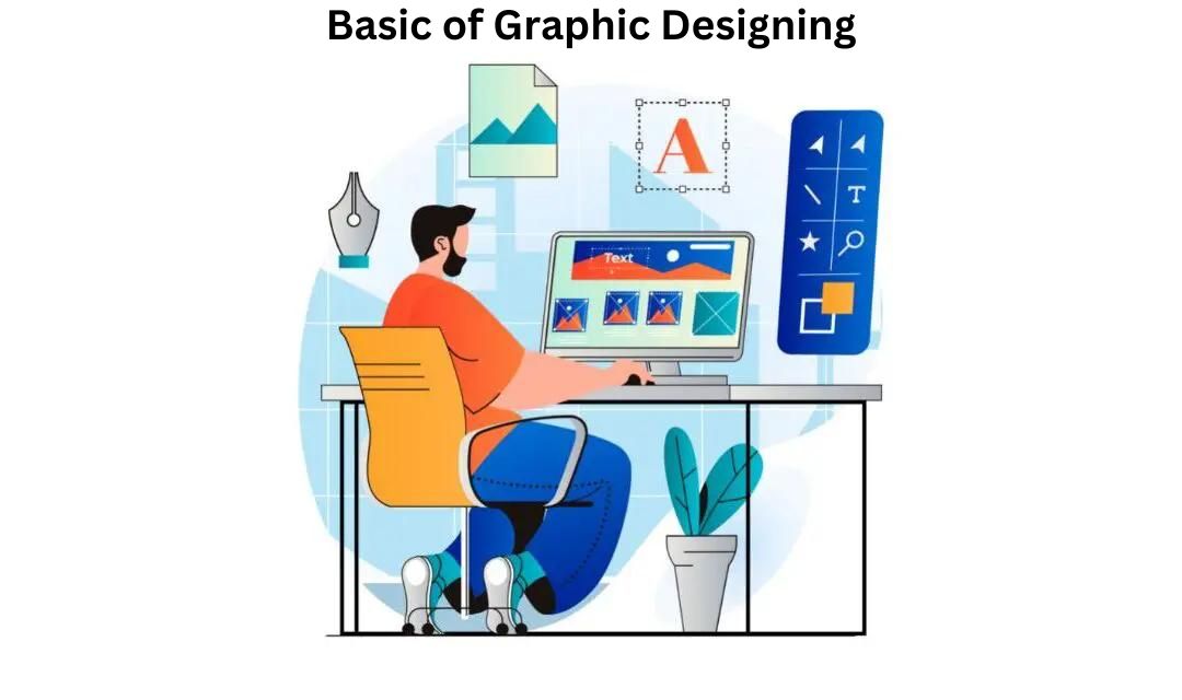
Why Is Graphic Design Important? Key Tips
Posted By Gaurav | 15-Feb-2023 |
Why Is Graphic Design Important? Key Tips
The work of a good illustration is being able to give the content eyes and in doing so able to give more in-depth meaning and context to the work. The work of a graphic designer is to be able to transform ideas and bring a campaign to life. But we did not need to tell you that because you already do. Here is the information you would’ve been looking out for:
- Simplicity Works Wonders
Sometimes instead of going big, it is best to stick to simple tones. Doing so makes the creative stand out and makes it extremely readable. Also, simple designs have a higher chance of getting people’s attention. People these days are straying away from cluttered creatives and prefer simple ones.
- Use Cohesive Colours
Using colours that go well together is best. Pick colours that work well on the colour wheel. Doing so will give you the best outcome. Using cool and warm tones, or complimentary colours is the move. Also, ensure to shade your creative well, and proper use of light and shadow effects can help make the concept come to life.
- Good Typography
A good font matching the content can help the copy’s readability. The fact that your audience wants to read what you have created is an excellent sign denoting that they are interested in your work. The good font has a great way to give the vibe and help give the audience an understanding of what they have in front of them.
- Maintain Visual Hierarchy.
Rember what is right in the front is going to look the biggest and have the most impact. And so on. As you create your design remember that it is ok to break the technicalities sometimes but it is also best to keep them in mind too.
- Use Social Media Templates.
Sometimes it is best to work smart and not overwork yourself by working hard. You can do so by creating templates and then using these templates to create designs that will help you cut time.
- White Space Is Key.
Negative space can make your design or break your design. Remember who you are creating this work for. Who is the audience? What they like, and what they want to get out of it. Sometimes the negative space can be used to leave it up to interpretation or to just balance the creative out.
We hope that these tips will help you succeed and create resounding works of art. Here’s to hoping to see your work on our social media, in print, or in any other form.
Also Read – Basic of Graphic Designing

